Exercise: Molecular Dynamics Analysis – Solution
In this exercise we will work on simulation data for the solution NMR structure of a small peptide (PDB-ID 6a5j). Refer to the last exercise for details on the preparation of the simulation. You can download the trajectory file simulation.dcd (~150 ns total length, 20 ps time step) here. A topology of the simulated system can be constructed from simulation.pdb, available here.
Info: The system was simulated in water but the trajectory only contains atom coordinates of the protein to save disk space. We can not perform any analysis involving solvent on our system anymore.
Similar to MD simulation setups and runs, we have many choices for how to analyse a molecular trajectory. Of the many programs and packages out there to perform various types of analyses, we will use MDTraj which you can install via conda:
conda install -c conda-forge mdtraj
We will also need the universal scikit-learn package:
conda install scikit-learn
[1]:
from collections import defaultdict

import matplotlib
import mdtraj
import numpy as np
from sklearn.cluster import DBSCAN
from sklearn.decomposition import PCA
[2]:
mpl.rc_file('../../matplotlibrc', use_default_template=False)
1 Open VMD and load the structure file simulation.pdb. The trajectory file simulation.dcd is in a compressed binary format. It can be read by VMD, but it can not be visualized on its own because it stores only coordinates and no information about atom types and alike. Load simulation.dcd into the same molecule as simulation.pdb (e.g. via File > Load Data Into Molecule). Choose a representation of the molecule that emphasises the secondary structure and watch the
trajectory as a movie.
a) Does the helical structure of the molecule remain stable over the simulation?
Yes, overall the helical structure is not lost
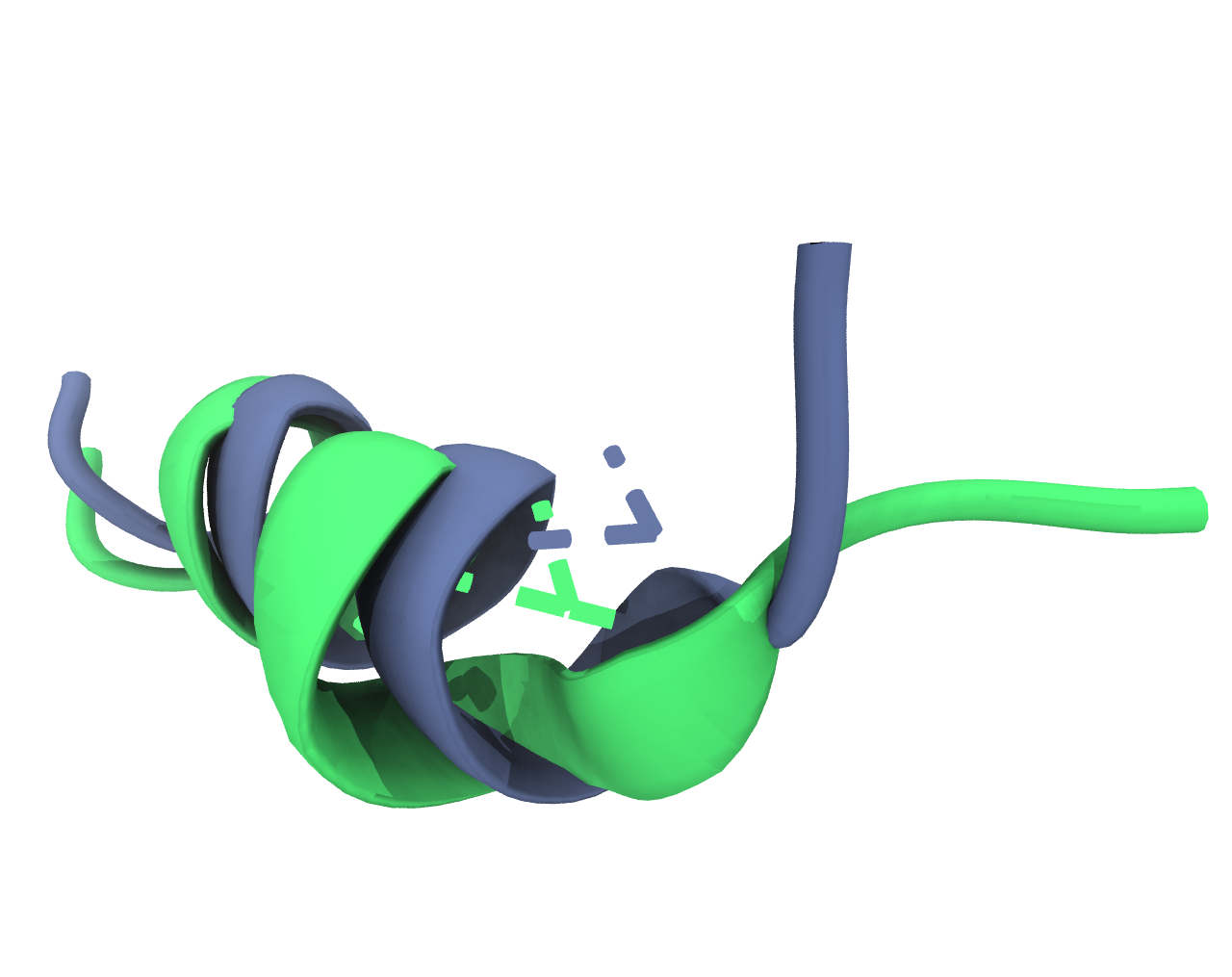
b) Include a figure of the last frame of the simulation in your report.

2 You may have noticed that the molecule jumps across the simulation box when you visualise the trajectory in VMD. This is due to the periodic-boundary-conditions applied. For the visualisation and also for certain types of analyses, we should remove those jumps. We should also remove translational and rotational degrees of freedom from the simulation by re-centering and re-rotating the molecule at every simulation step. Those motions normally do not contain much information, despite how the molecule floats through the box.
a) Load the trajectory using
mdtraj.load_dcd. You will need to specify the path to the trajectory file as first argument. Use the keyword argumenttopto specifysimulation.pdbas supporting topology file. Print the trajectory object for an overview and print the atomic coordinates (Trajectory.xyz) of the first atom in the second simulation frame.
[3]:
trajectory = mdtraj.load_dcd(
    "md_analysis/simulation.dcd", top="md_analysis/simulation.pdb",
)
[4]:
# Trajectory object
print(trajectory)
<mdtraj.Trajectory with 7789 frames, 260 atoms, 13 residues, and unitcells>
[5]:
# Trajectory coordinates
print(trajectory.xyz.shape)
print(trajectory.xyz[1][0])  # Second frame, first atom, x y z
(7789, 260, 3)
[3.0536022 4.662926  3.9863453]
b) Now we can use the method
superposeof our trajectory object to fit every frame of the trajectory to a reference structure. As we have only one molecule in the system, we will get away with that. If we would have also solvent in it, we would need to tinker with the periodic image as well. Usesuperposewith the trajectory itself as first argument and useframe=0to specify that the first simulation frame should be our reference. It is often a good idea to use a rigid reference group of atoms, so lets use only the backbone atoms of the protein and pass them with the keyword argumentatom_indices. You can get the atom indices withTrajectory.topology.select("protein and backbone"). MDTraj understands (almost) the same selections as VMD. You can also use thecenter_coordinatesmethod of the trajectory afterwards to center the molecule in the simulation box.
[6]:
fitted_trajectory = trajectory.superpose(
    trajectory,
    frame=0,
    atom_indices=trajectory.topology.select("protein and backbone")
).center_coordinates()
c) Save the fitted trajectory to disk with the
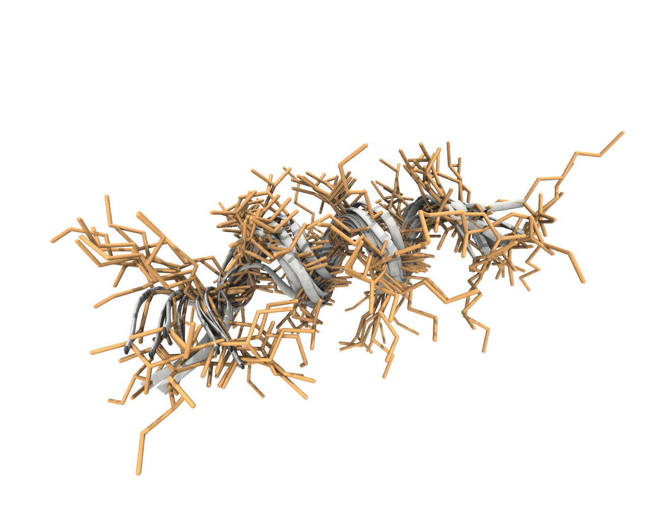
save_dcdmethod of the trajectory object. If you now visualise the trajectory in VMD you will notice that the jumps are gone and the trajectory snapshots are well aligned. Include a figure in your report that shows that the fit was successful, e.g. show 10 equidistant frames from the simulation and choose a different representation for the rigid backbone and the flexible sidechains (in the Graphical Representation window in VMD, there is a Trajectory tab in which you can control which frames are drawn).
[7]:
fitted_trajectory.save_dcd("md_analysis/simulation_fitted.dcd")
3 RMSF Looking at the MD trajectory as a movie is often not very telling. Let’s collect a few quantitative measures from the data instead to see what is going on during the simulation. First, we can calculate the root-mean-square fluctuation of atomic positions averaged over the course of the simulation to see which atoms move the most:
with \(\sigma_i\) being the RMSF of an atom, \(x_i(t)\) being a current set of coordinates at time \(t\) and \(\mu(x_i)\) denoting the average atomic coordinates (coordinates in a reference structure). The RMSF is basically the standard deviation of atomic positions.
a) Calculate the RMSF for the trajectory using
mdtraj.rmsfwith the trajectory both as target and reference. You can useprecentered=Trueas we fitted the structures before ourselves. The output should be a 1D NumPy Array of length 260 (one RMSF value per atom in the system).
[8]:
rmsf = mdtraj.rmsf(trajectory, trajectory, frame=0, precentered=True)
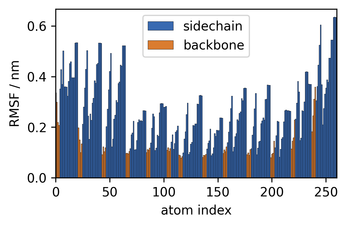
b) Plot the RMSF vs. the atom indices as a barplot. Plot the RMSF for sidechain atoms in a different color than the backbone atoms.
[9]:
sidechain_i = trajectory.topology.select("sidechain")
backbone_i = trajectory.topology.select("backbone")

fig, ax = plt.subplots()
ax.bar(sidechain_i, rmsf[sidechain_i],
       width=1, edgecolor="k", linewidth=0.2,
       label="sidechain")
ax.bar(backbone_i, rmsf[backbone_i],
       width=1, edgecolor="k", linewidth=0.2,
       label="backbone")

ax.legend()

ax.set(**{
    "xlim": (0, 260),
    "xlabel": "atom index",
    "ylabel": "RMSF / nm",
})
[9]:
[Text(0, 0.5, 'RMSF / nm'), (0.0, 260.0), Text(0.5, 0, 'atom index')]
4 RMSD Next, we can calculate the root-mean-square deviation of atomic positions (RMSD) to see how much the atomic coordinates change over time:
with \(\tilde{r}\) being the RMSD of a group of atoms at a given point in time.
a) Calculate the RMSD over the trajectory using
mdtraj.rmsdwith the trajectory both as target and reference. You can useprecentered=Trueas we fitted the structures before ourselves. The output should be a 1D NumPy Array of the same length as the trajectory (one RMSD value per simulation frame). Calculate the RMSD separately for the whole molecule and backbone atoms only.
[10]:
rmsd = mdtraj.rmsd(trajectory, trajectory, frame=0, precentered=True)
rmsd_backbone = mdtraj.rmsd(
    trajectory, trajectory, frame=0,
    atom_indices=backbone_i
)
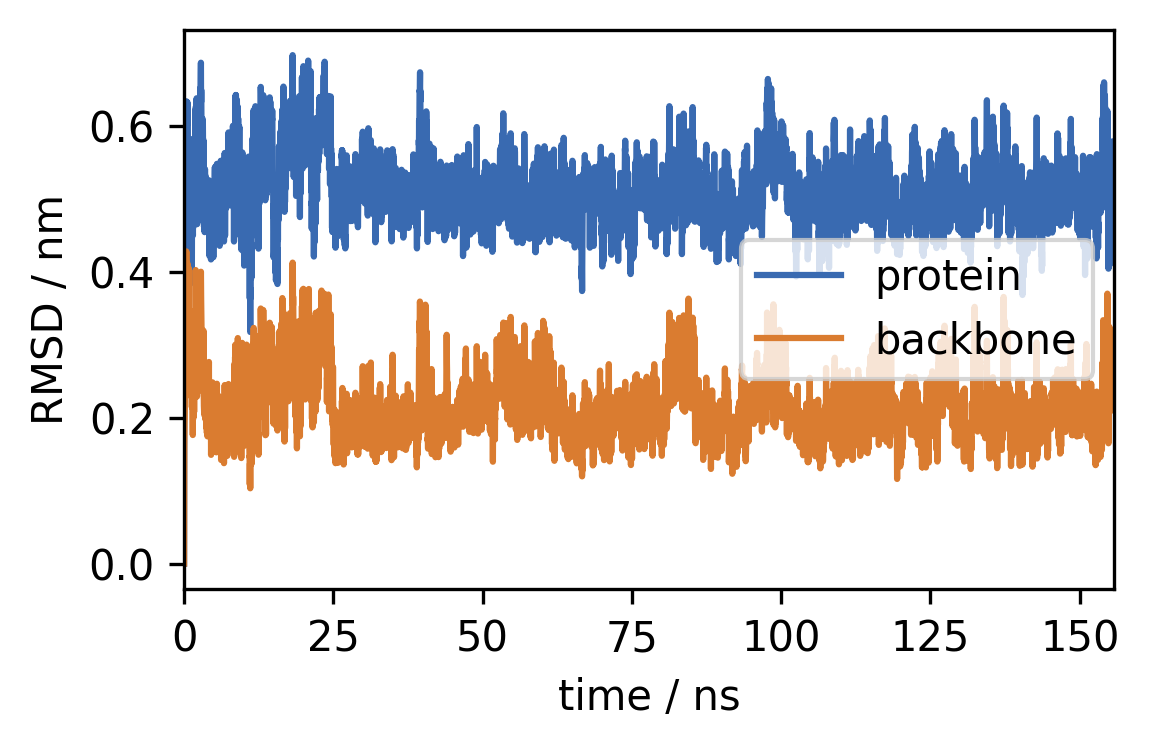
b) Plot the RMSDs vs. time (in ns) as a time series.
[11]:
time = [x / 50 for x in range(len(rmsd))]

fig, ax = plt.subplots()
ax.plot(time, rmsd, label="protein")
ax.plot(time, rmsd_backbone, label="backbone")

ax.legend()

ax.set(**{
    "xlim": (0, time[-1]),
    "xlabel": "time / ns",
    "ylabel": "RMSD / nm",
})
[11]:
[Text(0, 0.5, 'RMSD / nm'), (0.0, 155.76), Text(0.5, 0, 'time / ns')]
c) Compute a histogram (
numpy.histogram) from the backbone RMSD and plot the distribution of RMSD values. Choose a suitable data range (e.g. 0.1 to 0.4 nm) and an appropriate number of bins (e.g. 60) and normalise the histogram (density=True).
[12]:
range_ = (0.1, 0.4)
h, xedges = np.histogram(
    rmsd_backbone,
    bins=60,
    density=True,
)
mids = (xedges[1:] + xedges[:-1]) / 2

fig, ax = plt.subplots()
ax.plot(mids, h)

ax.set(**{
    "xlim": range_,
    "xlabel": "RMSD / nm",
    "yticks": (),
    "ylabel": "probability"
})
[12]:
[[], Text(0, 0.5, 'probability'), (0.1, 0.4), Text(0.5, 0, 'RMSD / nm')]
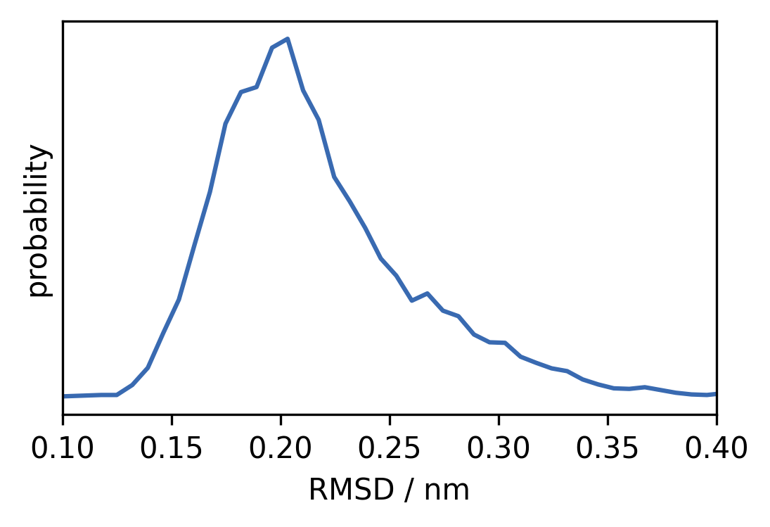
5 Hydrogen bonds are often a very important feature for the stability of protein structures. The presence of hydrogen bonds can be determined by using a distance and an angle cutoff for pairwise hydrogen–polar atom interactions (e.g. hydrogen–oxygen). If a hydrogen atom (attached to a polar atom) is close enough to another polar atom and if the angles of the partaking bonds meet a criterion, one can assume that a hydrogen bond is formed.
a) Collect hydrogen bond information from the trajectory data using the Wernet-Nilsson scheme (
mdtraj.wernet_nilsson). You can useperiodic=False. The result will be a list of the same length as the trajectory (one element per frame). The list contains 2D NumPy arrays, representing the bonds found, of shape(#bonds, 3). Each bond will occupy a row of the array with three elements that are the donor, hydrogen, and acceptor atom indices. For example the entry[103, 109, 46]describes a bond between the amino acid residues SER6 and LYS3. Atom indices can be mapped to atom names withTrajectory.topology.atom.
[13]:
def hb_index_to_name(trajectory, hbond):
    """Convert hydrogen bond index tuple to name"""
    return f"{trajectory.topology.atom(hbond[0])}–{trajectory.topology.atom(hbond[2])}"
[14]:
hb_index_to_name(trajectory, [103, 109, 46])
[14]:
'SER6-N–LYS3-O'
[15]:
hbonds = mdtraj.wernet_nilsson(trajectory, periodic=False)
[16]:
# Hbonds in the first 5 frames
hbonds[:5]
[16]:
[array([[103, 109,  46],
        [199, 207, 139]]),
 array([[114, 123,  68],
        [155, 164,  87],
        [177, 186, 117],
        [199, 207, 139],
        [218, 226, 158]]),
 array([[103, 109,  46],
        [155, 164,  87],
        [177, 186, 117],
        [199, 207, 139],
        [218, 226, 139]]),
 array([[218, 226, 139]]),
 array([[114, 123,  68],
        [177, 186, 117],
        [199, 207, 139]])]
b) Calculate the frequency with which the bonds are found over the simulation. You can use a dictionary using the hydrogen bond index tuples as keys and an integer counter as values. Loop through the found hydrogen bonds and increase the counter if a bond is present in the frame. Which bonds are present in at least 10 % of the simulation?
[17]:
# Count bonds
hb_frequency = defaultdict(int)
for frame in hbonds:
    for bond in frame:
        hb_frequency[tuple(bond)] += 1

# Filter out bonds with low occupancy
hb_frequency = {
    k: v / len(trajectory)
    for k, v in hb_frequency.items()
    if v / len(trajectory) >= 0.1
}

# Print frequent bonds
for k, v in hb_frequency.items():
    print(f"{hb_index_to_name(trajectory, k):>15}: {v * 100:.1f} %")
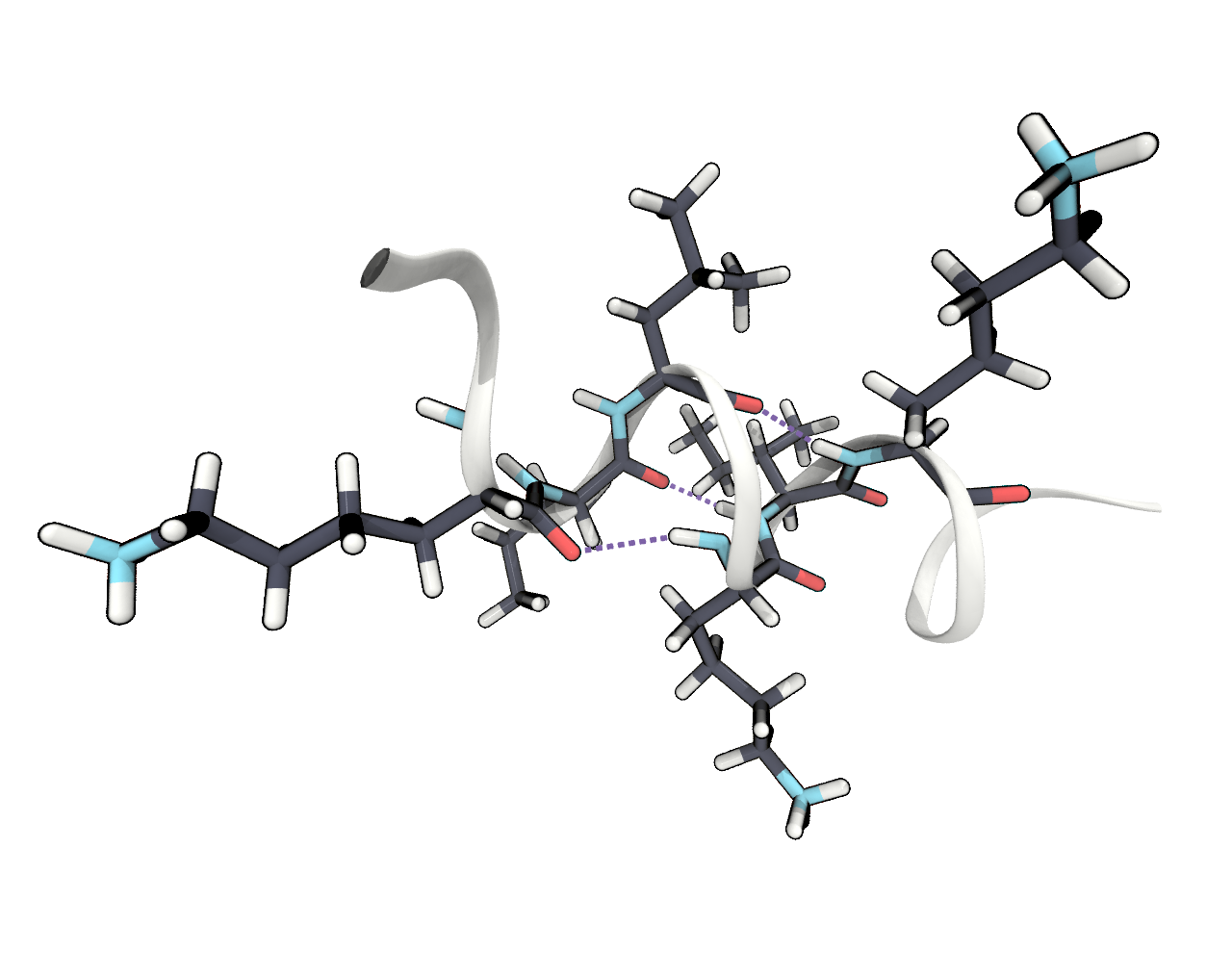
 LEU11-N–ILE8-O: 20.4 %
  LYS9-N–LEU5-O: 76.0 %
 LEU12-N–ILE8-O: 44.0 %
  ILE8-N–ILE4-O: 62.0 %
 LEU11-N–LYS7-O: 31.6 %
  LYS7-N–LYS3-O: 43.0 %
 LYS10-N–SER6-O: 39.0 %
  LEU5-N–LYS2-O: 13.9 %
  SER6-N–LYS2-O: 47.3 %
c) Include an image in your report showing one or more of these frequent hydrogen bonds. In VMD there is a representation style HBonds. Which of these bonds would you consider most important for the stability of the helix?
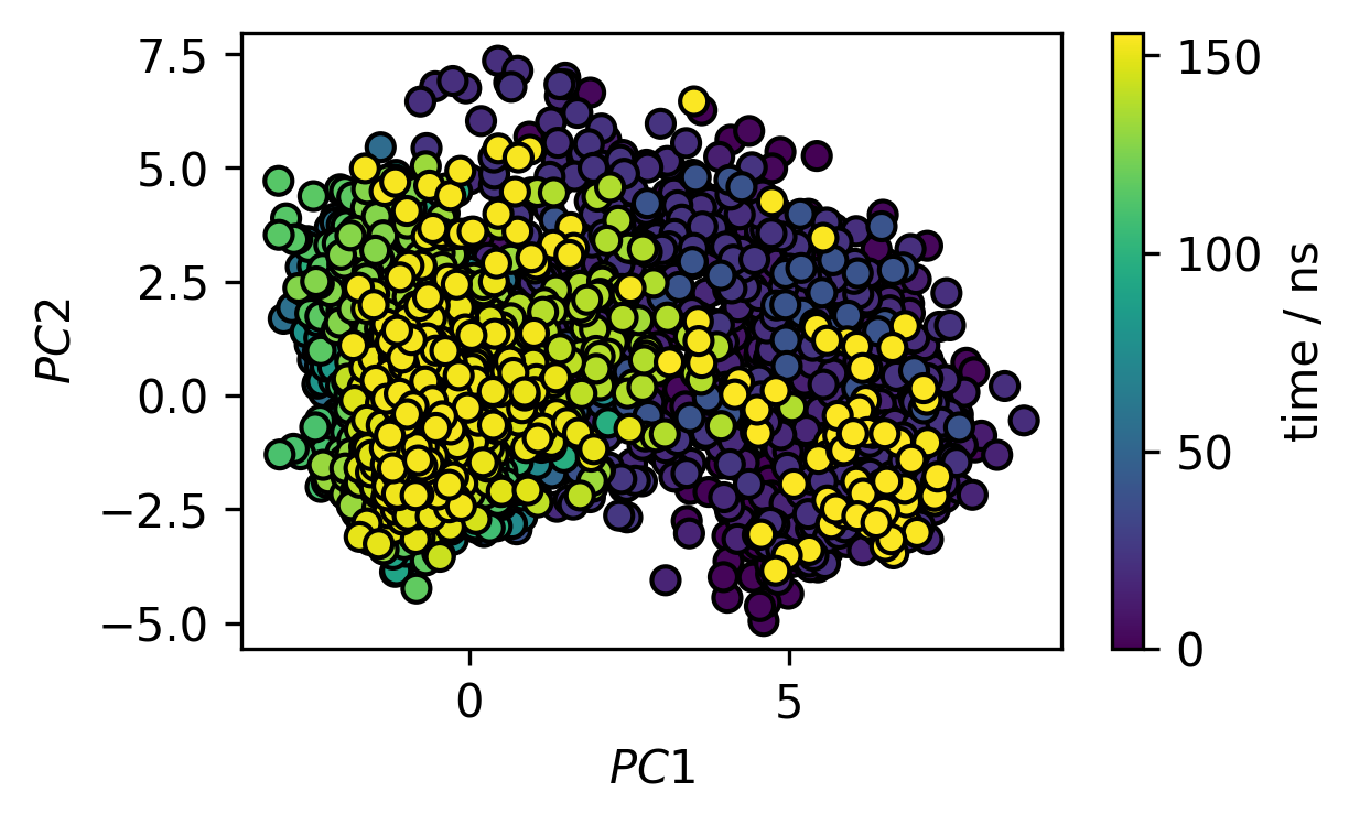
6 PCA The Cartesian space in which our molecule lives is already quite high dimensional (260 \(\cdot\) 3 coordinates) and it can be hard to identify the different conformations, i.e. energy minima, it can be in. Principle component analysis gives us the opportunity to project the trajectory from the complex Cartesian space into a transformed low dimensional space. We can use the sklearn.decomposition.PCA class from the scikit-learn package for this. This will automise the task of
constructing a covariance matrix from the trajectory and diagonalising it. Let’s represent our trajectory in the 2D space obtained by PCA, which will entail the molecular motion of the highest spatial variance, i.e. the largest collective conformational change.
[18]:
# Initialise sklearn PCA
pca = PCA(n_components=2)
The scikit-learn analysis is agnostic of the nature of our data. As we saw before the coordinates in our trajectory are stored in a 3D array with shape (#frames, #atoms, #coordinates). The analysis, however, expects a 2D array of shape (#frames, #coordinates) which means we need to forget about the atoms in the array structure and treat every coordinate the same (in the following it is assumed that our trajectory object was named trajectory).
[19]:
trajectory.xyz.shape
[19]:
(7789, 260, 3)
[20]:
pca_input = trajectory.xyz.reshape(trajectory.n_frames, trajectory.n_atoms * 3)
pca_input.shape
[20]:
(7789, 780)
Now we can use the trajectory as input to the PCA estimator.
[21]:
trajectory_pca = pca.fit_transform(pca_input)
trajectory_pca.shape
[21]:
(7789, 2)
As you can recognise by the shape of the transformed trajectory, we now have a trajectory with the same number of frames as before but in only two dimensions.
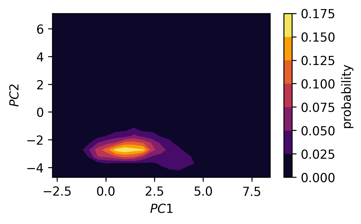
a) Plot the dimensionality reduced trajectory in 2D as a scatter plot. Color the markers by the time step and add a colorbar. Can you spot different states in the projection? Optionally, convert the projected trajectory to a probability density (2D histogram) and plot it as a contour plot as well.
[22]:
fig, ax = plt.subplots()
traj_plot = ax.scatter(*trajectory_pca.T,
                       c=[x / 50 for x in range(trajectory_pca.shape[0])],
                       edgecolors="k")
cbar = fig.colorbar(traj_plot)
cbar.ax.set_ylabel("time / ns")

ax.set(**{
    "xlabel": "$PC1$",
    "ylabel": "$PC2$"
})
[22]:
[Text(0, 0.5, '$PC2$'), Text(0.5, 0, '$PC1$')]
[23]:
# Optional: Plot of the probability density (not enough samples)
H, xe, ye = np.histogram2d(*trajectory_pca.T,
                           bins=(25, 25),
                           density=True)
xmids = (xe[1:] + xe[:-1]) / 2
ymids = (ye[1:] + ye[:-1]) / 2
X, Y = np.meshgrid(xmids, ymids)

fig, ax = plt.subplots()
traj_plot = ax.contourf(X, Y, H, cmap=mpl.cm.inferno)
cbar = fig.colorbar(traj_plot)
cbar.ax.set_ylabel("probability")

ax.set(**{
    "xlabel": "$PC1$",
    "ylabel": "$PC2$"
})
[23]:
[Text(0, 0.5, '$PC2$'), Text(0.5, 0, '$PC1$')]
b) In low dimensional spaces, conformational states can be spotted as regions in space where conformational snapshots accumulate, that is in low energy regions where the observation probability is high. Separating structures according to these states by hand can be, however, very tedious and error prone. This is what we can use cluster algorithms for. Cluster algorithms put a label on every point in a data set that indicates the membership of this point to a cluster. How a cluster – so a group of related points with similar properties – is defined, depends on the used algorithm. Here we could use the DBSCAN (density based clustering for applications with noise) method (available in the scikit-learn package as
sklearn.cluster.DBSCAN) to identify clusters as regions of high point density.
[24]:
# Initialise scikit-learn clustering
# DBSCAN - Points are in a dense region in space if they have a minimum
#     number of neighbouring points

# Cluster parameters:
#    eps: Neighbour search radius
#    min_samples: Minimum number of neighbours
clustering = DBSCAN(eps=0.4, min_samples=18)
labels = clustering.fit(trajectory_pca).labels_
labels
[24]:
array([ 3, 3, -1, ..., 0, 0, 0])
This will give us an array of labels with the same length as our trajectory (one label/cluster assignment for every time step). Plot the trajectory in the PCA space again as a scatter plot but this time color the markers by cluster membership (hint: Use a discrete colormap like tab20). Note, that the label -1 is used for noise points (not assigned to any cluster).
[25]:
fig, ax = plt.subplots()
traj_plot = ax.scatter(*trajectory_pca.T,
                       c=labels,
                       edgecolors="k",
                       cmap=mpl.cm.tab20)

ax.set(**{
    "xlabel": "$PC1$",
    "ylabel": "$PC2$"
})
[25]:
[Text(0, 0.5, '$PC2$'), Text(0.5, 0, '$PC1$')]
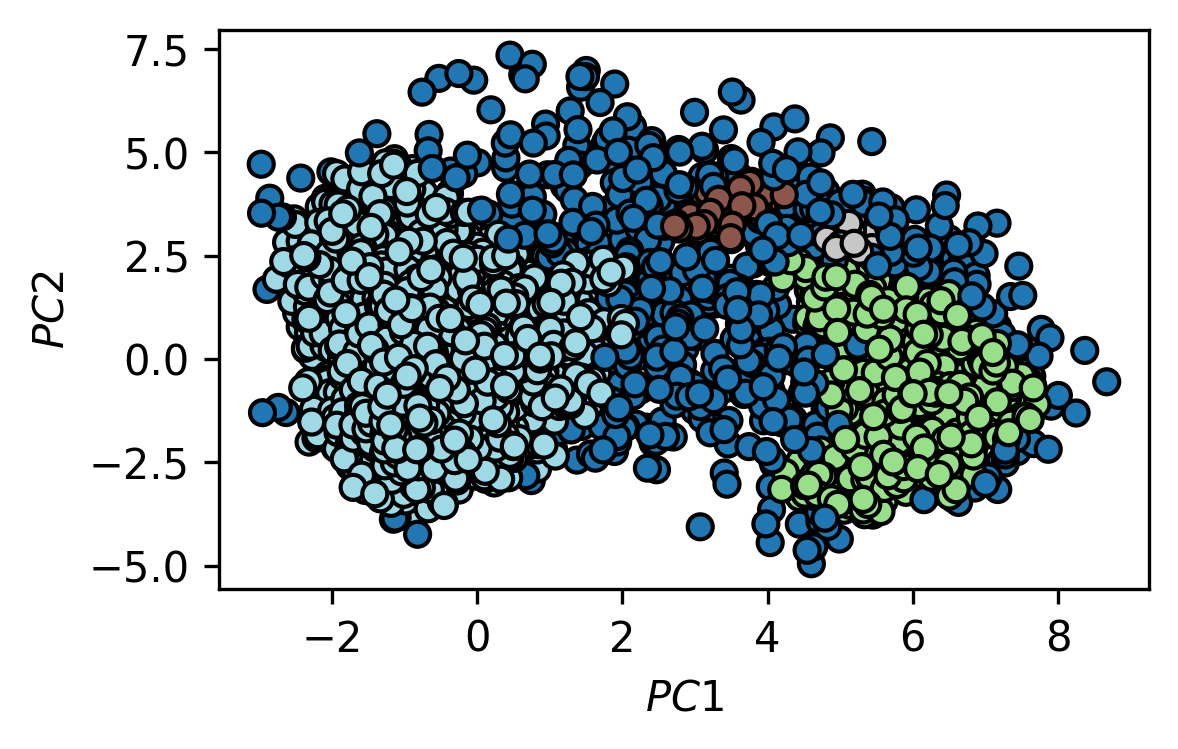
c) For the two biggest identified clusters, find the point that is closest to the arithmetic mean of the cluster. Include an image in your report that shows the two representative cluster structures in comparison.
[26]:
# We have 4 clusters
np.unique(labels)
[26]:
array([-1, 0, 1, 2, 3])
[27]:
for l in np.unique(labels):
    print(l, np.where(labels == l)[0].shape[0])
-1 534
0 551
1 53
2 20
3 6631
[28]:
def mean_point(l):
    mean = np.mean(trajectory_pca[np.where(labels == l)[0]], axis=0)
    distance_square = np.sum((trajectory_pca - mean)**2, axis=1)
    print(np.argmin(distance_square))
[29]:
mean_point(0)
484
[30]:
mean_point(3)
3213
[31]:
fig, ax = plt.subplots()
traj_plot = ax.scatter(*trajectory_pca.T,
                       c=labels,
                       edgecolors="k",
                       cmap=mpl.cm.tab20)

ax.scatter(*trajectory_pca[484].T, c="red", edgecolors="k")
ax.scatter(*trajectory_pca[3213].T, c="red", edgecolors="k")
ax.set(**{
    "xlabel": "$PC1$",
    "ylabel": "$PC2$"
})
[31]:
[Text(0, 0.5, '$PC2$'), Text(0.5, 0, '$PC1$')]

