Lesson A10 – Plotting
Python can not only be used to write programs that process and produce a lot of data, it can be also used to plot this data. In this tutorial we introduce you to the widely used third-party library matplotlib to put some nice looking graphs on the screen. If matplotlib is not already installed in your Python environment, do so via your package manager (e.g. conda install matplotlib).
We can only scratch on the surface of what this package can do, so check out the official documentation, too, if you want to learn more.
Advanced: There are a few other interesting packages out there to produce graphics in Python, like for example Bokeh, Seaborn (matplotlib based), or Plotly. Matplotlib might be a good starting point, though.
Taking the easy road
There are basically two ways to use matplotlib. The first, relatively easy and fast, goes via the pyplot submodule which provides a high level interface. The other, more complex but also more flexible, is to use elements from the matplotlib module directly. You can import both like this:
[1]:
import matplotlib as mpl
import matplotlib.pyplot as plt
The following cell is only needed to control the styling of the plots we will produce (font, fontsize, etc.). You can ignore it for now. Just keep in mind for later that you can make a lot of configurations via a matplotlibrc file.
[2]:
mpl.rc_file(
    "../../matplotlibrc",
    use_default_template=False
)
Generating plots from within pyplot is done by calling one of the provided plotting functions. The basic function plot() for example takes at least a sequence of values (y-values) and returns a 2D-line plot.
[3]:
plt.plot(range(10))
[3]:
[<matplotlib.lines.Line2D at 0x7f33e770d898>]
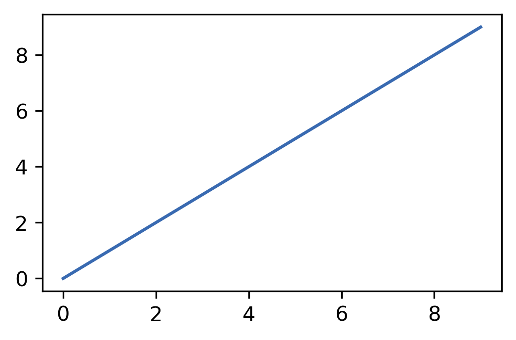
The x-values are in this case assumed to be a 0-based index. We can also pass x-values specifically. Per default plot() connects the plotted data points with a solid blue line. This behaviour can be changed with a bunch of optional keyword arguments.
[4]:
# Generate some data first

# Make a sequence (list) of 21 values in the open intervall (-1, 1)
# with increments of 0.1
x = [x * 0.1 for x in range(-10, 11)]

# Calculate x**2 for each value in the just created sequence
y = [x**2 for x in x]
[5]:
# Call of `plot`
# Use of keyword arguments modifies the styling
plt.plot(
    x, y,
    color="gray", linestyle="--",
    marker="o", markerfacecolor="#ff7f0e", markeredgecolor="k"
)
[5]:
[<matplotlib.lines.Line2D at 0x7f33e76649e8>]
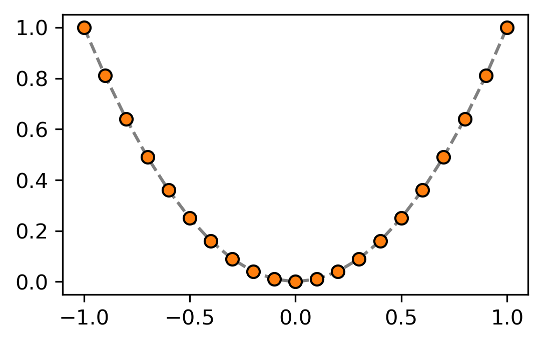
Note: Colors can be specified in matplotlib in many different formats, like for example by name ("gray"), special abbreviations ("k" - black) or as hex RGB(A) code (#ff7f0e). Find out more here.
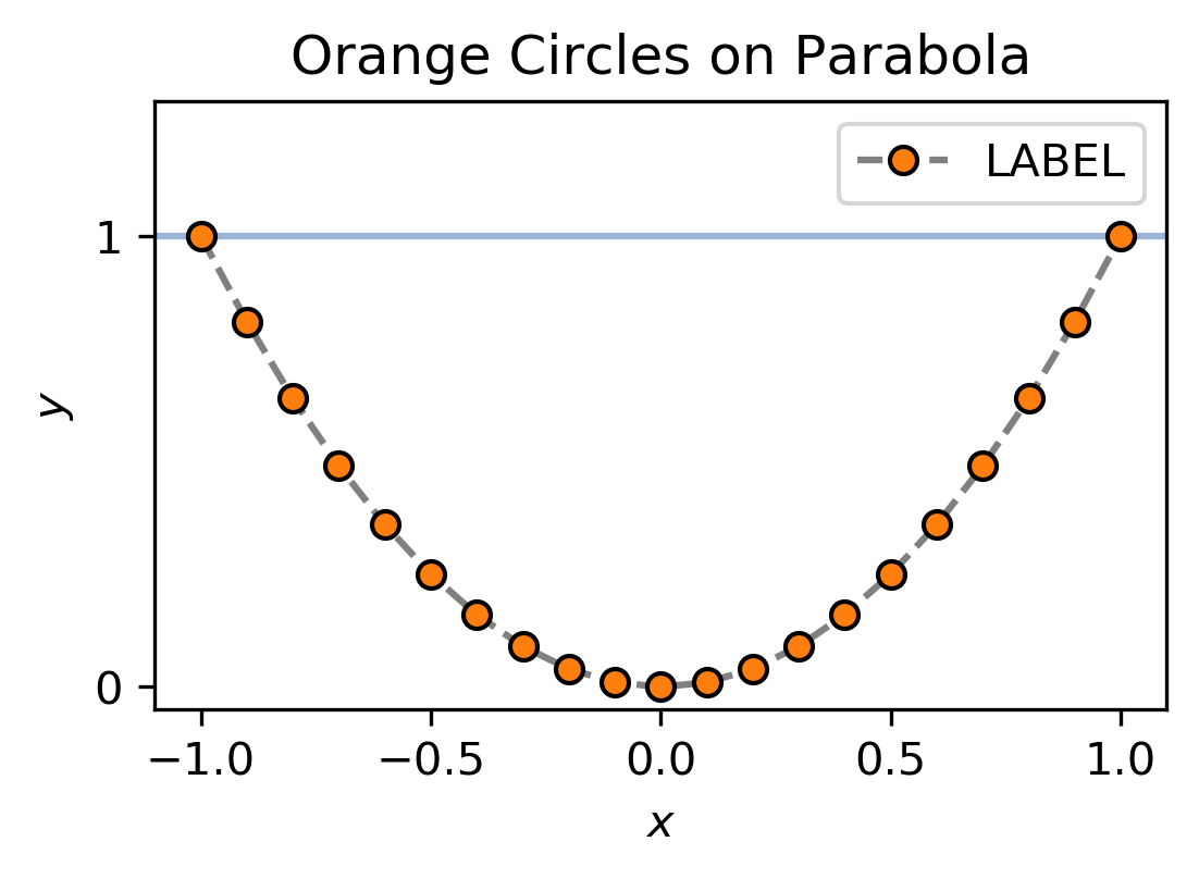
But a plot does not only consist of data alone. You can see that plot() also created an x- and y-axis, ticks and tick labels. Using other pyplot functions you can customise these other elements. Again other functions add new elements like, e.g. a legend (note that a line needs to have a label for the automatic legend generation to work).
[6]:
plt.axhline(1, alpha=0.5)
# Horizontal line at y=1; Transparency set to 0.5

plt.plot(
    x, y,
    color="gray", linestyle="--",
    marker="o", markerfacecolor="#ff7f0e", markeredgecolor="k",
    label="LABEL"
)

# Add plot heading and labels
plt.title("Orange Circles on Parabola")
plt.xlabel("$x$")
plt.ylabel("$y$")

# Which y-ticks to give a number?
plt.yticks((0, 1))

# Modify displayed y-data range
plt.ylim(None, 1.3)

# Generate legend
# By default legend reads out the `label` (see keyword above)
# of plotted lines
plt.legend()
[6]:
<matplotlib.legend.Legend at 0x7f33e763b390>
Advanced
Going the long way
Using the pyplot functions is convenient and can be suffient depending on what you want to achieve. This approach hides, however, two kinds of fundamental objects that make a plot: Figures and Axes. When the pyplot function plot() is called, a Figure instance is created in the background for you. It is not directly visible, but it is there.
[7]:
fig = plt.gcf()
# Get the current figure; Creates one if nothing is found
<Figure size 1200x741 with 0 Axes>
[8]:
type(fig)
[8]:
matplotlib.figure.Figure
A matplotlib Figure contains so called Axes (not to be confused with the actual axes, like the x-axis). Axes spread over the whole or a part of the figure-area and hold the various visible elements that constitue the plot. Similar to the Figure, an Axes instance is created by plot() for you without notice.
[9]:
ax = plt.gca()
# Get the current Axes; Creates one (and a Figure) if nothing is found
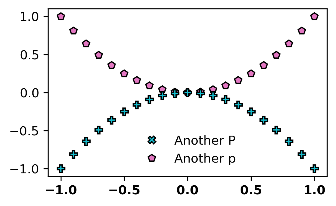
In a Jupyter notebook, a Figure lives only in its own cell, so trying to get the currently active Figure from outside the cell does not work. If this is all bit abstract for you now, do not worry! It will become clearer with an example:
[10]:
fig, ax = plt.subplots()
# We use pyplot only to create Figure and Axes in the first place

# plot y vs x unsing pink pentagons (marker = "p")
pink_pentagons = ax.plot(
    x, y,
    linestyle=" ",
    marker="p", markerfacecolor="#e377c2", markeredgecolor="k",
    label="p"
    )

# plot -y vs x unsing cyan plus (marker = "P")
cyan_crosses = ax.plot(
    x, [-y for y in y],
    linestyle=" ",
    marker="P", markerfacecolor="#17becf", markeredgecolor="k",
    label="P"
    )

# Plot nothing, but create a line object with crosses (marker = "X")
cyan_xs = ax.plot(
    [], [],
    linestyle=" ",
    marker="X", markerfacecolor="#17becf", markeredgecolor="k",
    label="X"
    )

# Add a custom legend
# Use manually specified lines (handles) and labels
ax.legend(
    handles=[cyan_xs[0], pink_pentagons[0], ],  # switched
    labels=["Another P", "Another p"],  # changed
    frameon=False,
)

# Go through all xticks labels and make them bold face
for ticklabel in ax.get_xticklabels():
    ticklabel.set_fontweight("bold")
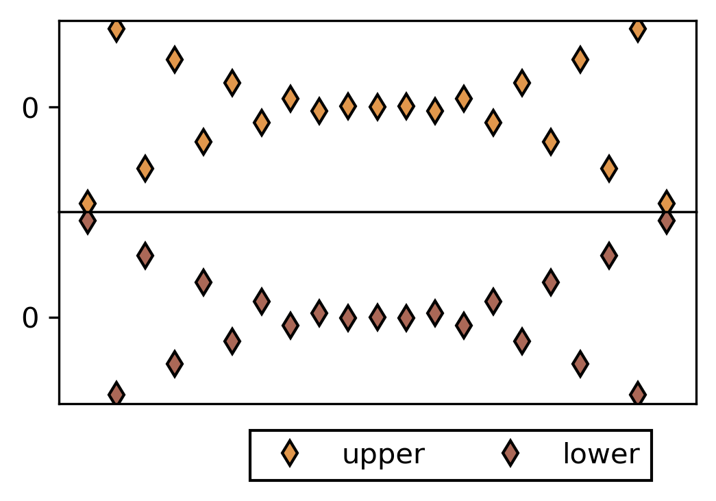
Working with fig and ax explicitly gives you much more control over your plot. It becomes especially important when you work with more than one Axes object, for example in more than one sub plot.
[11]:
fig, Ax = plt.subplots(2, 1)
# We use pyplot only to create Figure and Axes in the first place
# We want 2 subplots stacked in y-direction
# `Ax` is now a list of Axes objects [ax1, ax2]

# plot alternating y-values on upper Axes
upper = Ax[0].plot(
    x, [y * (-1)**i for i, y in enumerate(y, 1)],
    linestyle=" ",
    marker="d", markerfacecolor="#e1974c", markeredgecolor="k",
    label="upper"
    )

# plot alternating y-values on upper Axes
lower = Ax[1].plot(
    x, [-y * (-1)**i for i, y in enumerate(y, 1)],
    linestyle=" ",
    marker="d", markerfacecolor='#ab6857', markeredgecolor="k",
    label="lower"
    )

# Remove x-ticks on both plots and modify y-ticks
for ax in Ax:
    ax.set_xticks(())
    ax.set_yticks((0, ))

# Plot legend on lower Axes referencing both lines
Ax[1].legend(
    handles=[upper[0], lower[0]],
    fancybox=False,
    framealpha=1,
    edgecolor="k",
    ncol=2,
    loc=(0.3, -0.4)
    )

# Modify space between subplots
fig.subplots_adjust(hspace=0)